
Liferay and the problem of mobile for portals
The modern digital workplace and public internet is of course increasingly mobile. So for those enterprises with portal-driven experiences, what's the best way to "mobilize"?
The answer that most portal vendors give you may not be very satisfying. You see, most portal solutions display chunks of information and services (portlets or web parts) via some sort of "theming" mechanism that lays those chunks out on a page. Naturally, their typical answer to the mobile challenge is to develop "mobile themes."
Mobile themes typically work like this. The portal detects the device or mobile operating system and streams your portlets one by one in a different order, perhaps leaving some of them out entirely. That's a nice short-cut for a hard problem, but note that it's not true adaptive design.
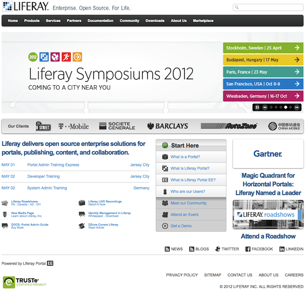
Consider for a moment the home page of noted portal vendor, Liferay. Here's the default view in a desktop browser.
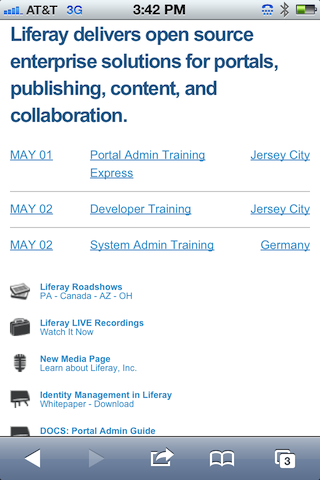
Now let's look at the series of screens for that same URL that get presented by Liferay's mobile-aware theme. You'll see that they stripped out some extraneous or not-mobile-ready portlets. Here they are, top to bottom.
.png)
* * *
* * *
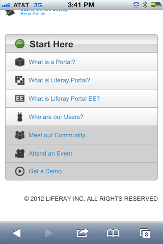
It's essentially a subset of portlets that have been concatenated vertically as I scroll down my iPhone. That's not a bad solution. It allows you to easily re-use existing components and prioritize them in different ways. I recently talked to one intranet manager who gloried in excising various lame-but-company-mandated web parts (e.g., CEO's speech) from her SharePoint mobile site.
The problem here is that stacking portlets and web parts does not necessarily lead to a great mobile experience. The same goes for simplistic mobile templates in a Web Content & Experience Management (WCXM) platform that simply streams down existing page elements in a specific order. The advantage to a WCXM platform, though, is that you typically have simple programmatic access to individual data fields, which means that you can modify the mobile experience at a much finer level.
Meanwhile, back on Liferay's inner pages, their default theme breaks down a bit. The first two screens on any inner page are always the top- and sub-nav respectively, which kind of gets in the way of the real content. To be sure, Liferay could create a different mobile theme for inner pages, though here again, that approach would probably require breaking out of the portlet motif.
In the end, there's two ways to think about mobile web experience:
- From the top down, taking a subset of your existing, pre-built components and ordering them in a sensible way
- From the bottom up, rethinking what content and services (and their associated display) make the most sense for your mobile visitors, and re-assembling from scratch
The former is much easier. The latter is much more valuable.
To be sure, other portal vendors suffer from similar deficiencies. For more details on how the top Portal vendors differ in their support for mobile-enablement, consult our detailed Enterprise Portal vendor evaluations.